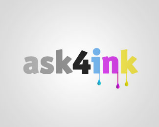
4 colors
by shiimera • Uploaded: Aug. 09 '07

Float
(Floaters:
1 )
Description:
this logo is for a friend of mine, she is starting a printing business, and i made this logo for here with many others...
i would like to have critiques about this one, and what inspire you when you see it.
thanks.
Status:
Nothing set
Viewed:
3366
Share:
Lets Discuss
shiimera, being in the industry, I get the print reference right away...but will the end consumer know that?..also the name, 4 colours means any colour, but again, the end consumer, will they know that or will the think that '4' is a limitation..you might be able to solve this using more colours in the logo.**fading out the letters in 'colors' might look like ink running out**I think the 4 should not have more presence than the 'colors'**just trying to help since you asked***good luck with this*
ReplyThank you very much raja for your comment, i'm taking all of them into account.**i know how the great public is ignorant, but i was trying to make reference to printing process while keeping the logo attractive, for the fadding letter is like motion blur, meant as impression for speed of the process. (it's a kind of F1 car nose)**the 4 is also a kind of word game ( For or Four ), the focus group i think is aware of the printing process.**once again thank you.**
ReplyWOW i figured out now that i got a comment from you Raja :D**you are one of my greatest inspiration and one of the most respectfull logo designer around.**once again thank you for your valurable comments.**Anwer.
ReplyI think the 4 needs to match the style of colours, or else needs to be stylized. Diagonal and in the same typeface.
ReplyPlease login/signup to make a comment, registration is easy