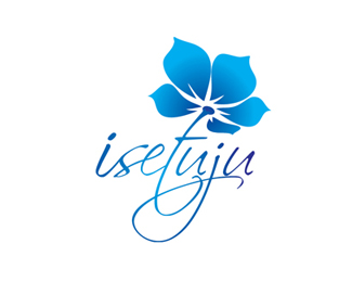
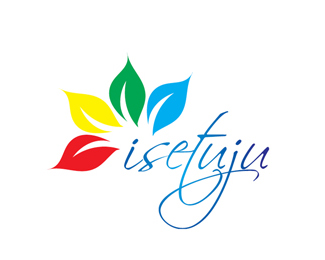
isetuju
by shahrulazmi • Uploaded: Mar. 01 '08

Float
(Floaters:
1 )
Description:
logo ideas for a website im working on, the site deals with wedding matters. i chose the floral motif because its universally used and accepted in most/all diff cultures
Status:
Nothing set
Viewed:
2292
Share:


Lets Discuss
This is so dynamic. I love it!!
ReplyI like the lines and flow of the logo. The main thing I noticed (looking at all 3 logos) was that the leaves are overpowering the thin, delicate type. You should experiment with making the leaves about 40%25 smaller. Otherwise looks nice.
Reply@Ocularink thanks again.*@SpiffyJ, thanks for the input. it actually echoes the thots i have in mind. a 2nd opinion from fresh eyes always helps.**this might be going thru another revision soon.
ReplyPlease login/signup to make a comment, registration is easy