Float
(Floaters:
0 )
Description:
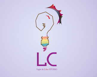
some test for a company logo called light and color
Status:
Nothing set
Viewed:
1174
Share:


Lets Discuss
I like it. Nice combination of colors. However - I'm not sure about the round shapes in the stylized light rays.
ReplyI dig the bottom of the bulb, but would work on the glow on the outside.
Reply@pixelmaid : thanks! i want show by round shapes a shine of this bulb.. mybe ur right i don't need to put it .. anyway i like it like this and ur critics are welcom**@Lakitu : thanks .. if i have some time i will try to made some test :)**thank u all
ReplyPlease login/signup to make a comment, registration is easy