Float
(Floaters:
45 )
Description:
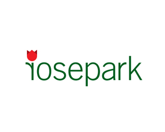
logo for a residential hub..
Status:
Client work
Viewed:
8106
Share:


Lets Discuss
Nice idea, i think it can work with the regular r too, don't you?
ReplyThanks tass.. yess it will! but with current one the r looking more like a leaf in open air.. wat u say?
ReplyGood combination, like it.
ReplyGood points by Tass but IMO this way it's more interesting:)*Also your rose reminds me more of a tulip, but I guess that's just me:)
ReplySolid concept. I agree with tass about the regular r. Flipping it seems unnecessary. Also, as Rokac pointed out, a little more work on the rose would knock this one outta the %22park%22. Coming along nicely though.
ReplyI don't think the concept (the leaf) will be lost by flipping it, it's true that right now it has more impact maybe, but this way the r can be interpreted as an isolated symbol and so you get osepark. :) Just my opinion.
Replythanks a lot guys.. feel great.. mean lot to me...*@Zibidy- thanks mate*@Rokac- yess this rose is inspired by tulip but this is way to be different , wat u say?**@tass- concept dont loss but not that effective i think.. ok i will up other one as well :)**@ocularink- i want a rose to be diff thats why i make like this.. do u want me to move towards traditional one or just resemblance is fine :)
ReplyI'd try moving more towards a traditional one. It can still be iconic. Right now, this just looks like a red tulip. If you google %22tulip icon%22, you'll see what I mean. In my opinion, a more traditional styled iconic rose will strengthen the concept. Hope this helps. :-)
Replylike it.
ReplyocularThanks Guys for ur comment %26 floats..*http://logopond.com/gallery/detail/109251*chk this one with regular 'r'..*still working on rose part ocularink :)*
Replyim uploading few options of rose icon with this one.. plz let me know wat u think..*
Replythe backwards %22r%22 makes you wonder why it's positioned that way, and when you finally realize, you see how great the logo really is. Good job, and much more effective than when the r is not backwards IMO
Replyi see some kerning issues, like r o s epa rk**otherwise a really nice work.
Replyupdated Lecart.. Thanks for suggestion :)*Thanks Pixelbatch for liking this one.
Replydig it
ReplyUpdated.. thanks Justin %26 nitty :)*@nitish- nice to see u bro.. long time
ReplySmart, simple, well-executed. Great work.
ReplyI've seen the other uploads too, and i think that you might be right this looks the most interesting. One final suggestion in order to combine the flipped r and a normal r would be to separate the flower into an independent symbol, but it guess that will bring you to a quite different result. So, so far this one is the best imo.
ReplyThanks jf %26 tass... *@tass- ya funny situation.. r or fliped r but i m still holding type on this though looking to improve rose icon..separate symbol.. i didnt thought much about that well i giv that a try as well :)
Replyhey I think....I like this one better. The audience will notice the r anyway....cool man!
Replythanks hanuman.. where ur icon gone .. i like that one..*
ReplyI think it looks great. I am a bit late to comment but IMHO i dont think it looks like a tulip. They always say if you make an image of a word that already exists in the company name then you make you're calling your audience dumb :). I think the word Rose bursts alot of visual aroma on the overall image. Once a brain reads %22rose%22 it starts scanning for rose images in anything else it sees. And to see the red color and the flowery image will be sufficient to recognize the brand. Just my 2 cents.. I think the name is enough and all it needs is a hint of red and a flowery shape. Good work! Cheers!
ReplyThanks Riz.. for a nice explanation %26 liking it :)
ReplyLiked this one a lot. Maybe the simplified rose can looks like a tulip but I understand how hard is to draw a rose in that simplification way.
ReplyOtherwise, I do agree with Noetic Brands about the reading and scanning process of our brains.
ReplyLiked this one a lot. Maybe the simplified rose can looks like a tulip but I understand how hard is to draw a rose in that simplification way. Otherwise, I do agree with Noetic Brands about the reading and scanning process of our brains.
ReplyThanks for the gallery spot guys..*thanks juliam for ur thoughts :)*
Replygrats!
ReplyHello, I like it, but at once I read %22josepark%22. *Great typeface choice and color scheme!
ReplyHas a great feel, like the way it works.
ReplyThanks to you guys.. for ur great support %26 thoughts..*
Replyautstanding, great job
ReplyIt looks more like tulip..
Replythanks guys .. BTW tulips are no very popular in India.. its a local client.. not even online..
ReplyPlease login/signup to make a comment, registration is easy