Description:
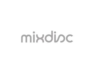
A personal project. I do mix CDs for family for birthday and Christmas presents, and I suddenly realized I had a branding opportunity there. Still in progress. I'm thinking of calling it "mixdisc by ryan" but haven't got to the "by ryan" yet.
Status:
Just for fun
Viewed:
4511
Share:





Lets Discuss
Any comments on the typography? Is the M too thin? Too short? Is the X too wide? Too tall?**I drew the type myself referencing a font I found, but I didn't like everything about the font, so I'm trying to perfect it.
ReplyLooks well balanced to me, Ryan. The s is a nice touch.
ReplyI like it - only comment: the transition between the 'i' %26 the 's' could be a bit smoother, more curved, rounded. It's a bit clunky at the moment.
ReplyI especially like the %22x.%22 The %22m%22 does look a touch short. Very cool though.
ReplyYeah I like it, just the bottom-left corner of the 2nd I could use a nicer curve to go with the transition into the S.
ReplyI think m could be opened up a wee bit, but really I think the x is throwing the whole thing off.
Replytpye breaks a bit betweem the i and the s...
ReplyPlease login/signup to make a comment, registration is easy