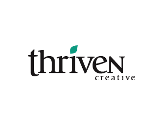
Description:
A lot of others seem to be doing this lately so I thought I would as well. Here's an unused concept that I did years ago for a potential design studio.
Status:
Just for fun
Viewed:
3056
Share:


Lets Discuss
Love the type work!
ReplyRyan. This is excellent in every way.
ReplyI love it! Especially the typography. But I've some tips for the alignment. Align the top of the T with the top of the H. The %22creative%22 with the right of the N. That's all :)
ReplyThanks for the comments.**Belkad, the t and the %22creative%22 are placed that way to give the feeling of growth and artiness. Growth because they expand out past the borders of the rest of the logo, and artsiness because they're %22colored out of the lines.%22
ReplyPlease login/signup to make a comment, registration is easy