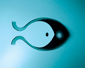
Description:
2 brothers own a Fish Market in a High end area and needed a new Brand identity, still working on the rest of the Branding elements.
Status:
Client work
Viewed:
3816
Share:



Lets Discuss
nicely done :)
Reply@Kaimere, thank very much indeed. it was hard to get the shadows lined up but it came out.
ReplyI like the feeling of depth of this. Very nice.
Reply%5E lots of depth! Thought it was a photo at first!
ReplyThank you Tass very much.**@ Chopeh, it is a photo actually, this is the concept for the sign at the store cut out in sheet metal and the light hitting it to create the shadow and the second eye just like this one.**Thanks guys for your comments.
ReplyRudy always been curious. Do you have direct access to all this printing stuff,die cuts etc.? If not your hanging out a lot at the shop %3B)
ReplyHa ha Mike, I'm an Industrial Designer by training, so I always think on the 3D options when creating something, and well, the clients pay for my playing %3B), that's the best part of all.**Question: what is that ' ' symbol with a twitter 't%22 doing there? this is the first time I've seen it.
ReplyAgain very cool!**%5E%26 yeah, no clue...
ReplyRudy, When I do die cuts etc. I'm coming to you for help? great stuff bro. Yeah what's up with all these google,twitter Fb links? humm
Replylooks like agreat implementation thought out ... kudos .. have to say i love this ...
Replycool on the twitter links David ... nice ha first one i have sent out
Reply@Mike, it would be an honour to work with you.**@Kaimere, Thank you for twittering and your comments for sure.**@Michael Spitz, thanks again dude.
ReplyCool, Rudy!
ReplyThanks Sean (ethereal), glad you approve.
ReplyThank you very much Jan Z. and Bryan.
Replynice rudy!
Replyyeah, I'm still figuring out how you did this...simply amazing :o
ReplyThis is Fantastic Rudy!! Excelente trabajo como siempre mi amigo :D
ReplyBig fan of your work Rudy. Well done (again).**
ReplyThank you guys very much (birofunk) Niall, (brygalope) Bryan, (Wiking) Phil and (Oronoz) Alan, gracias mi cuate.
ReplyNow this is very special ... why is this not in the gallery - this shows thought, execution and intelligence ...
Reply%5E I agree but there's also flicker and Behance, and to me recollection Logopond likes type with mark %3B)
Reply%5E http://logopond.com/gallery/detail/95074 this has type ... this version shows execution and a rare thing on here of a brand .. your worship ...
ReplyRex I really appreciate your comment, I'm just happy to belong to this community of great minds and creativity and share my work, the Gallery has never been a concern of mine, but I have to admit that when you make it, it feels special. Cheers.
ReplyQu%E9 barbaridad don rudy, your work blows me away every time.
Replythis is art, pure art. congrats, rudy!
ReplyThank you so much guys, @tocayo, I'm glad you see it that way :) , @MYWAY999, nice words, thanks.
ReplyPlease login/signup to make a comment, registration is easy