
Description:
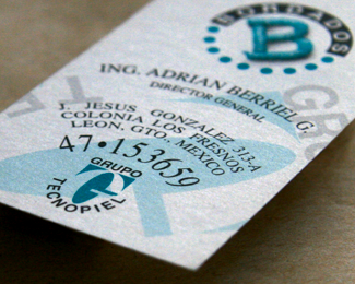
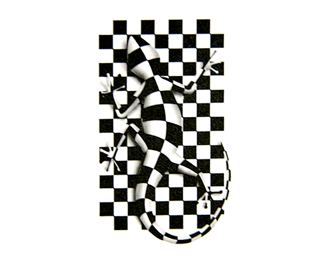
This logo I created in the early 90's, starting to dig up old work that I like, do you see a 'G' and a 'T'?
Status:
Client work
Viewed:
2214
Share:




Lets Discuss
Thank you guys, I hope you saw the G and T there.
ReplyHaha, i love the T G but i don't like the TECNOPIEL typography. it's clever but amateur. You have come a long way since the early 90's!!!
ReplyHa, ha, Diego, funny what you said, I liked the concept but I agree with you I will fix it just for myself when I have a moment.
ReplyPlease login/signup to make a comment, registration is easy