Description:
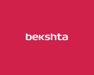
Bekshta building moscow logo. Moscow, Russia. 2012. Full project here -
http://www.behance.net/gallery/Bekshta-logo/5038401
Status:
Client work
Viewed:
11855
Tags:
type
•
red
•
Building
Share:


Lets Discuss
N I C E ! really enjoy seeing the behance examples of usage.
ReplyI don\'t want to be rude or anything, but can anyone explain what\'s so special about this?
Reply^ it\'s simple, solid, effective custom lettering. what\'s not to love?
ReplyI agree ^^. This is a strong identity, esp when supported by your behance presentation. The logo application to the reverse of the letterhead is really eye-catching. Good stuff.
Replyit's clean,simple,custom and well executed! Looks Very professional.
Reply@CT What I dislike about this logo (and similar designs) is that it lacks originality and distinctiveness. Again, no offence to the designer here, but what I see when I look at designs like this, is that somebody typed out the company name in a font that they liked, made a small modification to the K (which looks weird to me, btw) and called it a day.
ReplyIf you ask me what a good, distinctive, typographic logo is, then I\'d say Coca Cola or Kellogg\'s.
^ hmmm what font are you referring to here? looks pretty original to me. even if it is a slight modification (which by the behance project seems to be original), that\'s still alright by me. hell, it can be a straight up existing font without any alterations and still be a solid design as long as it pertains to the business and their brand.
Replyregarding the coca cola and kellogg\'s logos...those are great logotypes that have become timeless and identifiable through years of quality branding. i think it\'s easier to appreciate script typography because everyone assumes they are \'hand lettered\' and in most cases they are. having said that, i can tell you that creating a simple sans serif word mark can be just as memorable and exciting if it\'s well executed (like this one). oh and btw, i love the \'k\'.
I have no idea which font this is, but even if this font was designed from scratch, I still don\'t think it\'s that special. If you think, for example, about Jeep and Ferrari, which company logo comes to mind first? I\'m instantly thinking about the prancing horse and I vaguely remember the other company that had someone type out their name in Helvetica.
ReplyYou say \"it can be a straight up existing font without any alterations and still be a solid design as long as it pertains to the business and their brand\", which makes me wonder what the Jeep logo is supposed to tell or reference to? I see just a font. I guess we have different opinions on what is great logo design or maybe I\'m just too much of a noob to see a unique brand in a few letters.
Anyway, I appreciate script typography, because it is indeed hand-made and can have (and often has) much more personality and distinctiveness than straight up Helvetica or Gotham (with or without minor modifications).
blue, no offense to you, but i think you have a lot to learn my friend.
ReplyHave to agree with Colin here. I hear a lot of designers say, \"There\'s a lot more to branding and logo design than just typing a word and slapping it on a building/box/website.\" But.. I like to say, \"There\'s also a lot more to branding and logo design than just creating a trendy original mark or spot-on, amazing custom typography.\"
ReplyI could create a very memorable, unique, witty logo design for a client that: wins awards, is published in logo design books, sets a trend or becomes a benchmark, generates buzz for my own business... etc.
But what good does that do if it\'s not what the client wants but what -you think- the client should have, based on \"trends\" and what \"the majority\" tells us what good design should look like (the client knows their own industry/business better than anyone else)? And/or lacking in branding potential, not just for the moment but also for the future of \"said company?\"
@Colin: Don\'t we all? Tell me something I don\'t already know. :)
Reply@Tabitha: I never meant to indicate that you shouldn\'t do the research and just create pretty, trendy designs without even considering your client. Understanding your client and his business and creating a mediocre solution is just as pointless as making a good looking design, without even bothering to ask about the company you\'re designing for. As a designer you\'re supposed to listen to the client, but also to advise them and to show them why their ideas might not work and/or how they can be improved.
@PerfectBlue: I know what I\'m supposed to do as a designer. =P But thanks for the tips!
Replyblue, i tried to tell you something you didn\'t know, you were persistent in suggesting otherwise. guess that\'s why they call you \'perfect\'.
Reply@Tabitha: You\'re welcome!
ReplyColin: No need to get personal.
I think it looks very nice!
Replyand special too.
Replyyeah i came off a bit heavy there. apologies. i guess i\'m just passionate about type.
Reply\"you\'re ma boy blue\".
http://www.youtube.com/watch?v=mCnZqg1RgGA
I absolutely love this. The casual combo of upper and lower case is really great.
ReplyPlease login/signup to make a comment, registration is easy