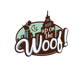
Description:
A dog food brand at Macys NYC
Status:
Client work
Viewed:
6677
Tags:
building
•
dog
•
brand
•
dog food
Share:

Lets Discuss
that's fun. I think the 2 browns are too close together. and the mint background doesn't seem to be working for me. Great illustration.
ReplyRobert Scully, you do great work my friend.I love the brown,light blue and don't mind the mint, but agree a little with KGB in regards to the tones of browns. But overall great design.
ReplyThanks So much KGB and Logomotive coming for the both of means alot. You both have some amazing logos in your showcase. Also I love that I found this website to get feedback and just show my work to my peers.**-rob
ReplyRobert...this is a very nice logo. I think the colors are nice, however I would have like to see the mint incorporated into the actual mark as well to tie into the packaging. Which I assume is what the mint background is for.
Replynice one Robert
ReplyBeautiful work.
ReplyGreat graphic representation of a fun name...
ReplyVery nice Mr Scully
ReplyLove the illustration dude
ReplyLoving the 1950s America angle, class work.*
ReplyI think this logo is so fun!
ReplyPlease login/signup to make a comment, registration is easy