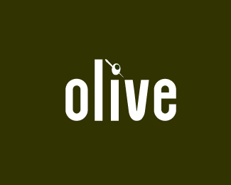
Float
(Floaters:
2 )
Description:
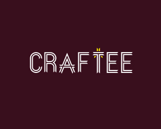
I wanted a simple logotype that had a clever mark built in!
Status:
Work in progress
Viewed:
2038
Share:


Lets Discuss
Looking good! I like the colour palette used. Whats the typeface?
ReplyPlease login/signup to make a comment, registration is easy