Description:
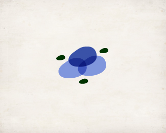
The client requested a mark that symbolized the blending of 6 healing elements in the requested colors of darker blue and green.
A whole-body wellness center, Flowing Harmony needed a logo that was less specific to a certain technique or treatment, and more all-encompassing.
As seen on:
www.flowingharmony.com
Status:
Client work
Viewed:
1319
Share:


Lets Discuss
Please login/signup to make a comment, registration is easy