Description:
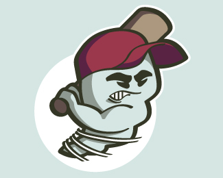
Logo concept (and my first attempt at a sports logo) for the Cyclones, a local baseball team. Before you ask, the client did not want the team name included in the logo.
Status:
Nothing set
Viewed:
2637
Share:

Lets Discuss
maybe try adding some black lines to where the grey shadowing is at the bottom of the body. The white circle behind him looks a little weird. Not sure wabout the lime green color behind it either. I like the character though. pretty cool. Nice job
ReplyNice linework. However, I first thought it was a ghost...and then a shark...I think you need to make the %22twist%22 of the tornado more apparent.
Replydont like the greenish background... it steals all the attention
Replydont like the greenish background... it steals all the attention, but i like the illustration
Reply%22Nice linework. However, I first thought it was a ghost...and then a shark...I think you need to make the %22twist%22 of the tornado more apparent.%22**Maybe some debris swooshing around him
ReplyThanks for the feedback.**@ its gareth: The client made similar comments about his body looking like soft-serve ice cream. You may be onto something. I ended up putting some Taz-esque swirls around his lower body, and they liked it.**@ GabrielRO: Yes, but I like green so much... You may be right.
ReplyThe green is far too bright. If you must keep the green, perhaps a lighter or less pronounces shade.%0D*%0D*I also thought it was a ghost.
ReplyI actually thought it was a sperm when I first saw it - no lie. I thought it might be a mascot logo for a pharmaceutical product.
Reply%22Combantrum worming tablets...fights worms that fight back.%22%0D*%0D*okay sorry. I only just realised that it was a cyclone. I really thought it was a worm. Maybe it was the shape of the face or the colour. Cool idea though! It's well illustrated, I just wasn't sure what it was.%0D*
ReplyThanks for all the comments. I decided to change it to an updated version, closer to what the client actually went with. This is my personal favorite incarnation of the sperm-ghost-worm.
ReplyThe wind bits work better adn the colour is nice :) Well done!
ReplyIt looks more like a screw now
ReplyNice one mate!
ReplyPlease login/signup to make a comment, registration is easy