Redesign Republic
by ricardobarroz • Uploaded: Sep. 25 '13

Float
(Floaters:
14 )
Description:
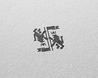
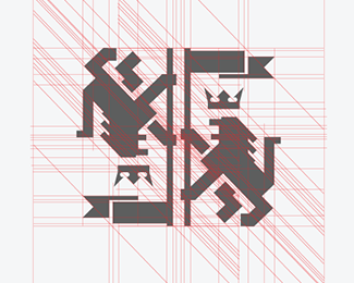
REDESIGNREPUBLIC
Redesign republic is a collaborative independent blog about creativity and inspiration. I wanted to create an indentity aligned with the common sense of a republic, that shows exactly the visual idea that everybody has when thinking about a republic: Classical decorated emblems surrounded by lions that brings a strong representation of greatness. So, the logo is explaining it's name also: redesigning an emblem with modern lines, easy to use and apply.
Full Project: http://bit.ly/16qIsDV
As seen on:
Status:
Client work
Viewed:
1947
Tags:
redesign
•
logo
Share:


Lets Discuss
Wow ... At first glance, I saw a swastika ... is a bit like that ... isn't it ??
ReplyI really like the emblem. How does it look with just one lion/one half? I wonder if having a reflection takes away from the crisp lion design a bit? Like your work by the way.
ReplyPlease login/signup to make a comment, registration is easy