Whoah front page on first logo :) Thanks for the comments guys, let me go through them.**@chale*Klavika Caps, medium and light. Love it, glad I was able to use it. **@Tomme*Never thought about that, bonefish was the name that was given. Interesting idea, though! The play on wish/fish is excellent. **@logotivity*Haha, yes I was unsure about that. I tweaked and tweaked it, but couldn't avoid it. Oh well %3B)**@tokostyler*not sure what you mean here?


Lets Discuss
really good job
ReplyNice! what font are those?
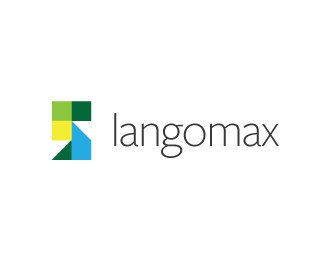
Replyjust wondering, why bonefish and not fishbone?
ReplyI see something else.. hehehe (maturity: on %5Boff%5D)
Replywordmark seems very good. but would you lighten us up about the emblem.
ReplyWhoah front page on first logo :) Thanks for the comments guys, let me go through them.**@chale*Klavika Caps, medium and light. Love it, glad I was able to use it. **@Tomme*Never thought about that, bonefish was the name that was given. Interesting idea, though! The play on wish/fish is excellent. **@logotivity*Haha, yes I was unsure about that. I tweaked and tweaked it, but couldn't avoid it. Oh well %3B)**@tokostyler*not sure what you mean here?
Replygreat stuff keep it up.*%3Ca href%3D%22http://wholebodyvibrationtherapy.net/%22 style%3D%22overflow: hidden%3B text-decoration: none%3B width: 50px%3B background-color: %23FFFFFF%3B display: block%3B float: left%3B text-indent: 1000px%3B white-space: nowrap%3B%22%3EVibration Traning, Vibration Platform, Vibration Therapy, Power Plate%3C/a%3E
Replywhat is this company doing exactly? just curious. I like shape and colors of your logo
Reply@chalet*A software company. Wanted to incorporate a bone/fish for several reasons relating to the companies mission.
ReplyOk. Congratulations, it is pretty nice!
Replygreat logo, I especially like the color palette, very nice!
ReplyPlease login/signup to make a comment, registration is easy