eercandy - proposal 3
by reesearchme • Uploaded: Aug. 29 '10
Float
(Floaters:
1 )
Description:
a proposal for a german music blog called eercandy - http://eercandy.blogspot.com/
Status:
Unused proposal
Viewed:
1415
Share:

Lets Discuss
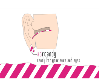
Sorry to tell you, but this logo is creepy as hell. I get the concept but your execution of stuff dripping out of an ear is actually pretty disgusting. With a little bit of thought and sketching you could definitely come up with a better way of graphically conveying your idea. I would also consider picking a better (more legible) font.
ReplyPlease login/signup to make a comment, registration is easy