Description:
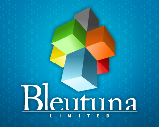
The Bleutuna Limited logo has been the same for the last 6 years. The concept of the cubestick has served the company well, but over time, the type treatment and the way color were handled have started to grow stale and a little 'old skool.'
This redesign of both typography, cubestick style and orientation, hints at the old mark, but pushes forward into the future with a more modern aesthetic.
The orientation change was done primarily to add a sense of 'power' to the logo, as the viewer is now looking up at the towering logo, rather than down.
The font is modified Adobe Caslon Pro & DIN Engschrift.
As seen on:
Bleutuna Website
Status:
Nothing set
Viewed:
4650
Share:


Lets Discuss
I like it, the background color gradient and multiple colors go well. I see about your orientation too. Cool.
ReplyPlease login/signup to make a comment, registration is easy