Steve Reich _V1
by plantingSeeds • Uploaded: Mar. 17 '10 - Gallerized: Jun. '10

Float
(Floaters:
31 )
Description:
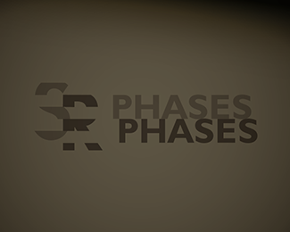
Identity for a Steve Reich invitational poster for the 2006 aniversary exhibition at The Barbican.
Reich re-recorded the fragment "come out to show them" on two tape-loops, which initially play in unison. They quickly slip out of sync to produce a phase-shifting effect. Gradually, the discrepancy widens
and becomes a reverberation.
----------
Here the "STEVE" follows one tape-loop, whilst the "REICH" follows the other. They synchronise on the "E" in both words.
Status:
Student work
Viewed:
10282
Share:

Lets Discuss
original!
ReplyI think is a bit difficult to understand, but it looks very original, and i must say i like it very much!
Replyoh very cool.. good stuff...
ReplyFloated for uniqueness.
ReplyFor me it's too hard to read. I read stretch or something like that.
ReplyCool. But I'd really like to see how it looks and works on a plain background.
ReplyI kept seeing stretch as well.. either way it's an awesome idea!
Reply%5E%5E%5Eagree wid art machine, xcited to c this applied on stationary...:D
Reply%5E agree.
ReplyI know Steve Reich, very interesting person, creative. Good job you did here!
ReplyReally cool. But, unfortunately, I absolutely cannot read it.
Replyfloated for the original idea, too hard too read imo
ReplyVery good - i read it immediatly, maybe because i'm listening his music? :-)
ReplyOh, this is for __the__ Steve Reich. Cool!
ReplyI got it immediately and for me it absolutely and completely communicates the music. I can appreciate that the reason I got it so quickly is that I know of Steve Reich's works (not a massive fan) and his manipulation of sound and minimalist approach seems to be reflected perfectly in this work. I think it's brilliant. Not too subtle and too obvious but to get that middle ground I feel takes real skill.
Replyel mejor
ReplySteve Reich, yes! Read it immediately too. A perfect fit :)
ReplyCheers for all the comments! Especially SteveG. *Art Machine: I'll upload a plain BG version next.**I've been absent from here for awhile so it was a nice surprise to check back here today and see one of my old logos being showcased on the frontpage :)
Replyi like it
Replynice work!
ReplyIt might be hard to read, but since it's a once off thing, then why not?
ReplyReally nice!
ReplyReally nice! Even though it is tough to read, but if it is a once off thing then why not?
Replyhaha, quite fitting.
Replyyeah it's good idea, but i don't seeing it without background, i'm confused what is a logo exactly?
ReplyPlease login/signup to make a comment, registration is easy