Description:
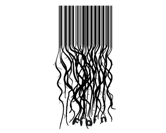
This wasn't created as a logo as such but as a promotional piece that would later be printed on t-shirts, bags etc. The idea is that the company has much more than commercialism at heart.. i.e their roots go deeper. Let me know what you think.
Status:
Nothing set
Viewed:
3530
Share:


Lets Discuss
This is a good idea, but it looks kind of messy. It thought it was for a cable company... Personally, I would loose the FABAN part and I would try to insert real naturalistic looking tree roots bellow the bar-code... Simple but more natural flow... Just an idea...
ReplyThanks for the comments Type08. I never personally liked the F%EDb%EDn inserted where it was but the client wanted it there. You think i should clean it up.. interesting. do you mean removing the smaller roots that are coming out of the bigger ones or do you mean simplify the actual root structure?
ReplyJust make it look more natural but simple... Like the real tree roots look like... Spread it more than the vertical path of the bar-code...
ReplyI thought it had to do with some hairdressing company or some shampoo and conditioner. :)
ReplyHairdressing Company? Interesting. I can totally see where you're getting that from. Never saw that now personally. I don't think i'd personally like to get my hair cut there if it was a logo for a hairdressing company... haha
ReplyLOL. Well it may represent an %22after and before%22 concept.
ReplyI saw the concept sorta. From a distance it looked like a bar code unraveling. I thought it creative but complicated at first. When I found out it would be printed at larger sizes so the roots could be easier seen, I think it is fine. Maybe not great. I agree the roots should be less vertical and more spread out so there is a lot less confusion.
ReplyPlease login/signup to make a comment, registration is easy