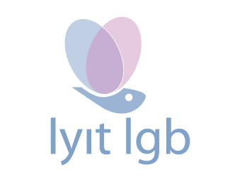
Description:
As my first submission I thought I'd upload an old logo I designed when I was way back in college. Looking at it now it is so clear it needs so much more work but before i start to look at it again i'd appreciate any help you guys could give me... thanks!
The logo was designed for the LGB society in college and features a butterfly to show freedom. The wings overlap to create three colours. 1 for the lesbians, gay and bisexuals being in the centre colour.
As seen on:
Status:
Nothing set
Viewed:
2223
Share:




Lets Discuss
I'm dieing for someone to leave me a comment so i guess i'll have to do it myself. haha
ReplyThanks for that relevant. I think i tried it without the eye but might re-look at that again and see how it comes across. The type is definitely wrong. it looks way too corporate. it needs something that compliments the softness of the logo itself and something more friendly and approachable.
ReplyPlease login/signup to make a comment, registration is easy