Description:
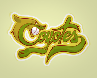
Baseball team of my son
Status:
Just for fun
Viewed:
4085
Tags:
ball
•
coyotes
•
coyotes
•
team
Share:


Lets Discuss
Ummm Ok
ReplyI appreciate your comments. I really like to think it's different. I know that design is not looking confused but I think this logo conveys what he has to say but an unconventional way and for that reason has value. I guess that was what he saw LogoPond. Not to sound proud but I think the logo brings something (perhaps repudiation, or maybe a strange taste) and strongly. I live in Mexico and aesthetics is definitely different from the American here ... we are more strident ... lol One of the Aztec goddess characterized by being dismembered (Coyolxauhqui) lol (justifications for something I simply love) and color Truth is much to my regret, just are the team colors. green and yellow. but again thanks for comments
ReplyPlease login/signup to make a comment, registration is easy