Description:
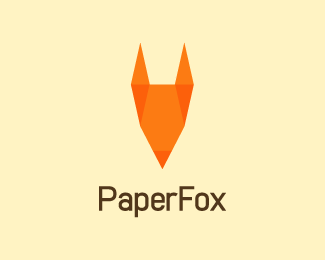
Logo for the print company. Pencil and fox in this interesting origami combination.
Status:
Work in progress
Viewed:
17063
Tags:
fold
•
origami
•
geometry
•
paper
Share:

Lets Discuss
not a bad idea... not a bad idea at all...
Replyi think a pointy nose extending from the face and not overlapping the face is a better solution to show a fox.
ReplyTnx people**1 more variant:*http://i31.tinypic.com/kdvczc.png**Maybe, best so far...hmm?
ReplyI like that last one the most.
ReplyLatest reminds me of %22this%22:http://logopond.com/gallery/detail/52709
ReplyLast one match better, but it is still raw.
Replylike the image, but the type is killing me
ReplyLogo is updated.*Font is changed, fox is also changed.
Replynow it looks nice ...welldone bro :)
ReplyBetter
ReplyLooks great, I like how you changed the fox. Great concept!
ReplyTnx ppl :%5D
ReplyCOOL
Replygreat concept ...
ReplyNice concept. You're on the right path. My main * critique * is make the face of the fox shorter as it's not that long. Other than that. Great work. Yes, a fox has been done many times, but this is the first I've seen a logo design of a fox as origami.
ReplyLove the symbol and the colors.
ReplyNice one Jovan!
ReplyVery smart, i like it's origami approach/interpretation. Nice work!
ReplyTnx tass, vld, mariqua !
Replykwell one...good use of geometry...
ReplyThis one is very nice looking!
ReplyHvala Ognjene! Tnx Joe!
Replysimply killer work !!
ReplyBern, you are so kind!
ReplyGreat logo
Reply49 logo designers agree with you :)
ReplyPlease login/signup to make a comment, registration is easy