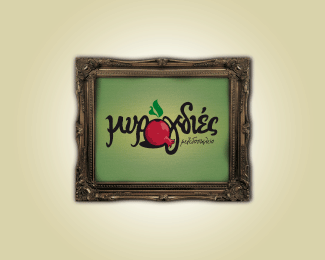
Description:
BACKGROUND: The old town of the city of Rethymno is full of cafes, restaurants, bars, tavernas and trade stores. It has a history of Venetian influence and Turkish monuments. Its� narrow alleys gives you the impression of a flashback in time. The newly built restaurant of Myrogdies is in the heart of the old town and offers splendid and irresistible tidbits and a very traditional Cretan and Mediterranean cuisine.
CHALLENGE: The main obstacle here was to really overwhelm the competition which was really too much but not that strong. We needed to keep the traditional look but really make it look like new, contemporary and much different from what the visitor will be seeing around the old town.
SOLUTION: �The word Myro-gdies, if we unveil it we realize that in fact is of two words, Myr (gift given to Gods) and Rogdies (the pomegranate: the fruit and seeds of life and afterlife).� Creating the logo should keep the readability of the name but also picture the pomegranate. This was much emphasized when the classical frames were used as a secondary element that would be seen throughout the restaurant, sign, coasters, menu etc. Colors and layout presented in the best way the nature of the surroundings of the restaurant.
RESULT: Myrogdies quite often communicates special events such as live bands, special nights, parties etc. A lot of applications have already taken place following the visual identity rules (sign, business cards, coasters, posters, menu, print ads).
Status:
Nothing set
Viewed:
1738
Share:

Lets Discuss
really enjoyed reading the description!.. would love to visit the town sometime!
ReplyPlease login/signup to make a comment, registration is easy