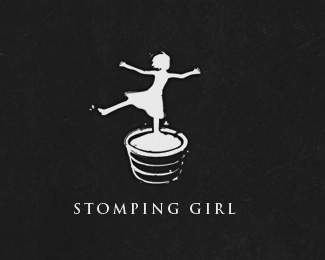
Stomping Girl Wines
by onesummer • Uploaded: Jan. 30 '10 - Gallerized: Sep. '10

Float
(Floaters:
95 )
Description:
stomping girl wines
As seen on:
stompinggirlwines.com
Status:
Client work
Viewed:
11044
Share:


Lets Discuss
you need to add this with text... this is brilliant...
Replylove it ....plz add text too
ReplyDang, Paul...where you been?! This is sweet!
Reply@all, thanks. sorry, wasn't contracted to do text.**@kevin, i've been here and there. my full time job takes up most of my time these days, unfortunately, logo design comes 2nd. and pretty soon it'll be a distant 3rd -- the wife's pregnant with our first baby!
Replyfantastic style of illustration. the best i can do these days myself is just look... we had our second baby 4 months ago and everything goes out the window! thought its worth it, good luck with the pregnancy.
Replylove this one.
Reply/me heads to the liquor store
ReplyNice work Paul. And congrats on the new baby. CWilk
Replyonesummer, so much character in this, so nice
ReplyReally nice graphic Paul
ReplyInstant favorite!
ReplyNice onesummer nice one son.
Replynice! :)
Replygreat
ReplyPossibly it's exactly the impression you want to achieve, but to me the posture and clothing of the girl look like dance / ballet.
Reply@all, thanks!**@barryconvex. bravo! nice to see someone pick up on that feel, as it was intended so to convey how a little girl, who, instead of doing the job tasked to her (stomping grapes), is daydreaming of what typical little girls may daydream about...being a ballerina. cheers!
ReplyThis is beautiful - concept and execution. Perfect.
ReplyI'm with nido...throw some type on this so we can see it in the gallery. Awesome
Reply@JoePrince, okay, I updated so it has text now. never realized it had to have text to be in the gallery. Thanks for the tip.
Replyalso might want to center it. again, among my all time favs.
Replyoops. now centered. thanks.
Replyhey man, i see you've centered the mark on the type, i was talking about centering the whole logo in the canvas. it is slightly to the left now. and i think the first alignment you had on the mark vs type had better balance. however, this is well worthy of a gallery spot, with or without the type.
ReplyI think you could bump up the type a bit more but lovely and unique. I will always remember it.
ReplyThis was looking a lot better without the type, tbh. I think it needs some more love. Nonetheless, great design.
Replymaybe try placing type slightly below waistline and to the right of mark and reducing mark, that seems like it might work better?? hard to tell at this point.
Replylooks great even with trajan.
Replylove it!
ReplyAnthony makes a good point regarding the layout of the mark. I'd try topicdesign's suggestion.
ReplyBeautyfull mark!!
Reply@all, thanks! updated.
ReplyThis is so good! The use of the color is just perfect. Congrats!
Replyi love this, awesome job onesummer!
Replythis is awesome !
ReplyPlease login/signup to make a comment, registration is easy