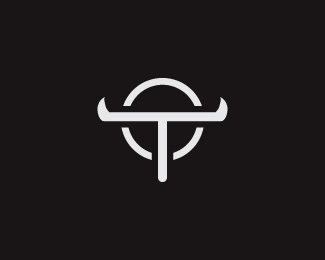
Description:
concept for a steel pipe manufacturer for the oil and gas industry that is based in Texas.
Status:
Unused proposal
Viewed:
6925
Share:

Lets Discuss
Reminds me of the Windows Longhorn logo... But than again anything with horns like that propably would :)
Reply@AdamO, lol, you must be constantly reminded of the longhorn logo then as there are a ton of images in the world that include horns %3B)**@b3nder, yes, it was intentional. It was supposed to be a subtle effect to strengthen the mark as a branded (like a cattle brand) symbol%3B however, I admit, I should have either left it out or implemented it better.
ReplyClean design. On point. I would love to see it implemented into site, stationery, ads, etc.***Joseph Szala*www.vigorbranding.com
Reply@b3nder. thanks for the suggestions. I don't like to leave things 'incomplete' so I went ahead and updated it.
ReplyNice and clean. Very effective identity.
Replywhatever happened to this comp. I think it was abandoned by the CH, right? Great mark!
ReplyI just found out that this has been chosen for one of logolounge's new Master Library series book.
ReplyPlease login/signup to make a comment, registration is easy