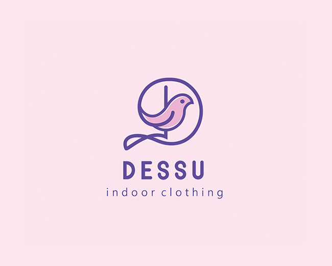
Dessu
by olkiller • Uploaded: Dec. 15 '16 - Gallerized: Dec. '16
Float
(Floaters:
75 )
Description:
DESSU-indoor clothing
Status:
Client work
Viewed:
6,378
Tags:
brand brandidentity branding font identity logo logotype DESSU indoor clothing
•
indoor clothing
Share:


Lets Discuss
I'm generally not a fan of tracked-out lowercase letters. But here, not only is it not necessary but it's also sticking out beyond the main lockup of your logo. If I was you, I'd line up the outer edges of "indoor clothing" with "Dessu". I think it would look stronger.
ReplyHave you tried to make a smoother loop under the bird?
ReplyThank you for your opinion.
ReplyGreat!!!!!
ReplyAmazing work as usual! :)
ReplyPlease login/signup to make a comment, registration is easy