Centre For Rehabilitation Of Wildlife_
by nzuzomtetwa • Uploaded: Oct. 16 '11

Float
(Floaters:
8 )
Description:
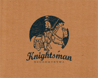
C.R.O.W is a centre in Durban that deals with rescuing and rehabilitating injured animals. C.R.O.W is an abbreviation of Centre For Rehabilitation Of Wildlife, they are based at Yellow Wood Park. They are a non profit organisation and they dependent on peoples donations and assistance. So i decided to have a human element in the design emphasizing the relationship between man and animals.
Status:
Student work
Viewed:
2431
Share:


Lets Discuss
Thats an interesting design. :)*question, hope you dont mind.. why a deer?
Replythank you, CROW sent me pictures they took as reference for me to inspire me, so there was this one image of one of the managers kissing a deer so i worked around that image.
ReplyHello, Nzuzo, your photo looks really cool, by the way :)
Replylol!:) thanks action, do you do photography too?
ReplyNot now, but someday I think I will start to shoot pictures of life :)
ReplysWeEeT!!!!
ReplyBut damn, first time seing black skin logo designer :) so cool
Replylmao! are you serious? which part of the world are you from?
Replylol! i ment which country are you from, are there black designers? i thought they were everywhere (im sorry if it sounded wrong) hahahahaha
ReplyI am from Lithuania, so there is only white brothers :)*You are my first known designer who's black skin.*By the way, Nzuzo, where are you from? America?
Replylol! im going to google your country and check it out:)! no im not from America, im from South Africa, have you heard of it? i assure you there a more way better black designers here hahahahahaha!
Replythis sign is absolutely amazing ... love it !
ReplyThank you very much type and signs, im glad you like it :)
Replynice, i would get rid of the shadow. i don't think there is any need for it. also, shrink everything down a little to give it some breathing room. maybe like 30%25.
Replyyeah thanks for the suggestion Colin, i see what you mean, i got caught up having fun designing it lol!
ReplyPlease login/signup to make a comment, registration is easy