Description:
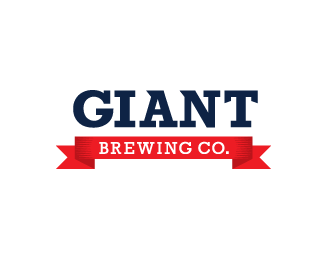
Logotype for a craft brewery. This will be wrapped around the neck of the bottle.
Banner updated.
Status:
Client work
Viewed:
1688
Share:



Lets Discuss
I think the banner needs some work. I don't see any reason for the folds to be so angular, and separated with such a fat white gap. Maybe just make the folds vertical? Also, I can see that there are some hatch lines for shading, but they're way too subtle. Nice work.
ReplyHey Sam, thanks for the suggestions. I updated the banner based on what you said, and I think it looks much better!**Kudos :)
Replyyeh i really like the simplicity of this.
Replyi'm just nitpicking but the background gradient is hurting my eyes. i think a solid white would suffice. also, the kerning in GIANT needs a little work. i read it as GIA NT.
ReplyMuch better! Colin is right about the kerning, I almost mentioned that in my last comment. You could probably make a nice ligature out of the A and the N. I also agree about the background. Gradient backgrounds are sometimes okay for presentation, but I've come to realize that white/gray gradients are a little weird.
ReplyThanks again for the advice Colin and Sam! Made some more changes, now I'm looking for those floats! %3B)
ReplyPlease login/signup to make a comment, registration is easy