Nikola Matošević
by nikola • Uploaded: Apr. 30 '17


Float
(Floaters:
11 )
Description:
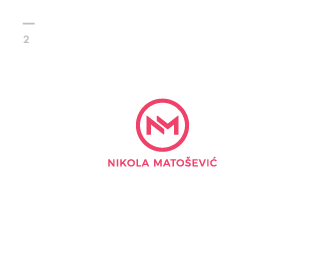
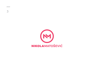
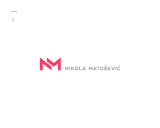
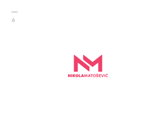
Was about time to refresh my personal monogram a little bit and edit the type used for my name and surname. I'm still not sure which works the best so I need your help :) I really like my monogram surrounded by a circle, although the simplicity on the versions without the circle draws also my attention.
Also the type, thin or bold?
What do you think, which one looks the best and why? Looking forward to your feedbacks!
Status:
Client work
Viewed:
3742
Tags:
•
alphabet
•
strong
•
bold
Share:

Lets Discuss
Please login/signup to make a comment, registration is easy