Description:
process sharing...
As seen on:
the Little Big Company
Status:
Nothing set
Viewed:
16822
Share:



Lets Discuss
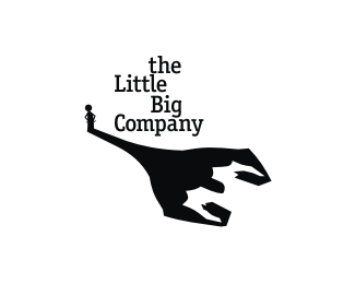
I like your concepts Nav. Kinda cool I almost see another figure in the white space of the shadow.
Replycheers Mike, very kind of you to say... in regards to the %22figure in the white space%22... personally I just think you have reached the Zenith of logo designing %26 simply are able to see things everywhere... anywhere... you cant help it now...
Replytakes one to know one :)
Replyyeah I know you are so what am I!... :p
ReplyI'm like rubber and yer like glue, so what bounces off me sticks to you.
Replymy dad can beat your dad up...
ReplyMy MUM can outcook yer MUM.
Replyand i can eat both dishes in no time... :p
Reply%5Ehogoholic
Reply%5E only if they tend to put a lot of onion there :)
ReplyScooby Dooby Doo. Nice
ReplyMama get my gun...this kid's too good!
ReplyIs this supposed to be a sumo wrestler?
Replyyou cats are crazy... lol...
ReplyBrilliant concept!
Reply:D
Replynido strikes again, this is super cool nido!
Replynido's the little one
Replyreminds me of another logo. NOT in concept, but in idea. the one with the buildings where the little building has the biggest shadow. remember? both concepts are fabulous. floated.
Replyawesome, as usual
ReplyVery nice. Love the concept and the text placement is kinda cool.
Replythanks folks... the name was fun to play off...
ReplyGreat mark !
Replynice concept and execution %3D)
ReplyCool Nido, I presume the shadow is flexing his muscles, but it kind of looks like a scary monster about to eat someone!
Replywow.
Replywat a thought, amazing lil big logo
ReplySimply a little big nice well done idea! **theartistt: almost everything remembers another things, including logos. %3B)))
Replybrilliant!
ReplyMantiox chawe... :D
Replywhat a mark! great!
ReplyWhat a story!
ReplyGREAT!! in my favs
ReplyVery good one
ReplyPlease login/signup to make a comment, registration is easy