TokyoCircle
by nido • Uploaded: Jan. 13 '08

Float
(Floaters:
5 )
Description:
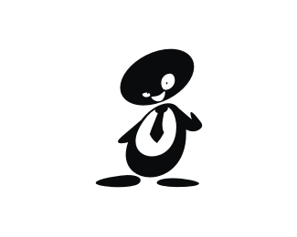
A social networking website for English speakers living in Tokyo. Another version. Based on Japanese Technology/anime...
Status:
Nothing set
Viewed:
3138
Share:


Lets Discuss
I like where this one's going, nido. Maybe more 'kidrobot' style... you know, big head small body.
ReplyExcellent design my friend. The robot is beautiful. I really like it. Personnal preference for the previous one, stronger and more symbolic for me. Very nice job on the font, The c's look great. May be the r could be slightly extended and kerning between T-o reduced...
Reply@Hacker.. thanks bud%0D*%0D*@firebrand... thanks to you too.. to be honest ive never heard of 'kidrobot' but i like your suggestion %26 i think ill do that!%0D*%0D*@Thomas, merci!... will work on the font suggestions... thanks for pointing it out!
ReplyHey this is really good, I much prefer it to the purple one you did before. I'd argue with Thomas though I'm afraid, the C's look too much like G's, mostly just the lower case one. As he says though, T-O needs tightening but loving the mark!**What is the red bit on his face?
Replyupdated.. Thanks guys**@artboy.. the red bits a kinda cyclops eye.. %26 also a reference to the red sun on the Japanese flag.. cheers!
ReplyI think the robot's head looks a lot better mate.
ReplyI wish this robot wopuld be a game hero :)))
ReplyGood! What typeface you use for the lettering? Looks similar, but tweaked a bit?
ReplyPlease login/signup to make a comment, registration is easy