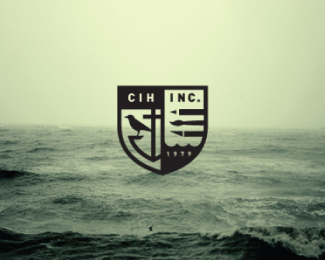
Description:
Here is one of the concepts for my dads business.
Since 1979 C. I. Hood, Inc. has been providing graphic design, illustration, and advertising design to its customers in the Pacific Northwest, West Coast and Around the World.
This crest combines art tools, a crow, anchor and sea waves. The crow is a heraldic element from our family crest. The anchor and sea waves represent the large amount of maritime work they do.
The beautiful photo is by Anna Morosini.
http://www.flickr.com/photos/a_morosini/
Status:
Work in progress
Viewed:
17781
Tags:
•
maritime
•
sea
•
raven
Share:

Lets Discuss
nice again good symbol has power as tommy hilfinger brand.
Replyreally goood
Replybrilliant!
Replynice presentation! :)
ReplyDamn good.
ReplyVery Nice Nick.
ReplyThanks guys!
ReplySolid Nick!!
ReplyTimeless!!! Great job, Nick!
ReplyBrilliant work Nick!
Replytop notch piece!
ReplyVery stunning mark!
Replylove it:) a lot happens in this mark, clever..:)
Replyamazing work!
Replylove the tone / mood
ReplyThanks! It does have kind of a melancholy feeling about it due to the beautiful photograph.
ReplyGreat work. And the logo fits nicely with this photo. Congrats.
ReplyLooks great!
Replyexcellent!
ReplyReally good.
ReplyCast your vote for logo of the year on logomoose.
Replyhttp://www.logomoose.com/blog/logo-year-2013-voting/
Please login/signup to make a comment, registration is easy