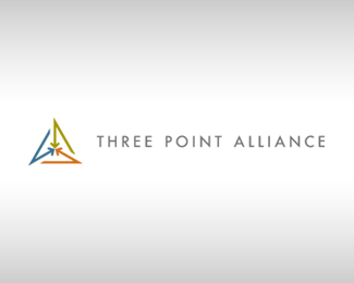
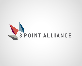
Three Point Alliance #4
by nattiemon • Uploaded: May. 29 '09

Float
(Floaters:
7 )
Description:
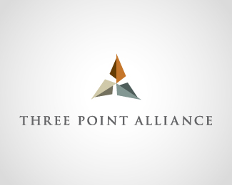
3 companies came together to create a single entity in the financial services industry. They found strength in packaging their services together. Ultimately realized that this wouldn't work for the client and was abandoned also. Check out the final version. Let me know what you think. Comments appreciated.
As seen on:
Check out the Final Version Here
Status:
Unused proposal
Viewed:
3860
Share:
Lets Discuss
I like this one most of the three you posted. I think it would have even sweeter if the arrows were lighter in weight and/or spaced slightly further apart. Good job.
Replythanks, I agree about the weight they do seem a little heavy after not seeing it for awhile, I think that might have helped the proximity to each other, seeing as how i was trying to get them as close as possible to relate to the name more... thanks for the comment.
ReplyIm not a fan of the typography, but the icon is fun. Some might see it as an 8 at first, but once they they read the name it will make sense%3B maybe you can add some space to open it up a little. Again, the type is a yawnfest. Keep knocking it out!
Replyhey typo thanks for the comments, i agree with the 3 looking too much like an eight... since the client never even saw this version i didn't really take the time to refine the type, although because 3pt sells their services to mostly banks, im not sure if those %22corporates%22 would like anything other than a %22yawnfest%22 :)
Replythanks for the remarks everyone.... agreed climax
Reply1 i think this is the best
Replythanks tass
ReplyPlease login/signup to make a comment, registration is easy