TD - Trafford Design (with type)
by nathantrafford • Uploaded: Mar. 10 '11 - Gallerized: Jun. '12
")
Float
(Floaters:
50 )
Description:
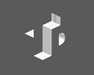
Architecture Logo idea my brother asked me to come up with. Look at it as if the T is facing the left, and the D is facing the right. Pretty much fried my brain sketching this out. This version has typography with it.
© 2011 Nathan Trafford
Status:
Work in progress
Viewed:
17146
Share:

Lets Discuss
i'd say you did a pretty sweet job on this.
Replythanks man! much appreciated. I love illusion type stuff
ReplyVery cool constructivist / cubist style logo.
ReplyI've tried to do this once before and haven't executed it nearly as well as you have. good balance and composition. Great job!
Replythanks people!
ReplyVery nice work! Love that it takes a moment to see whats going on here.
ReplyWow, nice job on achieving the optical illusion. I like how it looks with the minimal type lockup. Looks very architectural. On screen, at this size, the thin lines from the mark blur together, causing it to look a bit messy, but it looks fine in your other, larger version (just the mark). Printing this at small sizes could prove challenging if those lines are smaller than .25 pt. You might want to think about working up another version that doesn't use such thin lines (or any lines at all), that would be used at smaller sizes.
ReplyI know it, that line mushiness makes me sad :/ Maybe the smallest version has less lines?
ReplyThis logo is very nice. Not so simple as I thought first 5 seconds. :)
ReplyFreaky :)
ReplyWicked
ReplyNice Escheresque work :)
ReplyVery nicely balanced logo. Great wok!
ReplyThis is intense! Me likey.
ReplyWow, what a great effect. My mind doesn't know what to focus on.
ReplyThanks guys! Fun little exercise of a logo. Need to figure out a way to make those vertical lines less goofy on screen.
ReplyAfter few seconds...The "T" appeared! Great idea and excellent execution. Mark of another level!
Replycrazy stuff! ;D ... love it!
Replythis is awesome! can I ask what your font is? great job.
ReplyThank's everyone. This is simply Helvetica Neue - light condensed.
ReplyPlease login/signup to make a comment, registration is easy