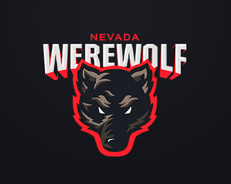
Description:
football college team
Status:
Work in progress
Viewed:
7947
Tags:
werewolf wolf college sport animal football
Share:





Lets Discuss
It's a really great start! I love the shape of the wolf and that bold red color!
ReplyIt's a little odd that the name is "Werewolf" and not "Werewolves", isn't it? But, I guess that's not a design critique. It looks really nice. The red outline is a little unconventional, but I think it's mostly working. I think it would improve if you had some small strips of red on the wolf's face, as if some red light is shining across it.
Replymaybe the wolf could be more aggressive, like a wild beast to capture the image of a werewolf. To me it looks like a tough wolf without the "were". It's just the expression, everything else is great, especially I like the red glow of the tpye!
ReplyPlease login/signup to make a comment, registration is easy