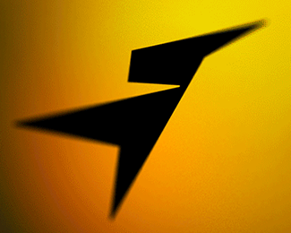
Simple and bold. Bugs me that the typo verticals don't parallel with the bird. While the chest angle is probably too much... the angle of the back could apply to the type easily.
Thanks guys)
I appreciate your advice, the client has chosen a completely different version, which I would not want to show. But many thanks for your advices. I'll try to use all of them in the future.


Lets Discuss
Real nice!
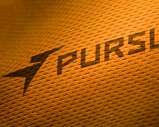
Replyit's awesome to see this work here on the main page. very nicely done!
ReplyYes, very nice
Replyvery nice... great balance between icon and font!
ReplySimple and bold. Bugs me that the typo verticals don't parallel with the bird. While the chest angle is probably too much... the angle of the back could apply to the type easily.
ReplyThanks to all friends!
ReplyLogoboom - It not bug for me))
I must say that Glen has a point - back of the bird should be slanted equally with letters imho
Replyor letters slanted to back of bird. That last 10% from good to great.
Replyyeah, what glen said ^
ReplyLove this. Agree with previous comments though - I would redraw the bird only using the available angles from the letters.
ReplyThanks guys)
ReplyI appreciate your advice, the client has chosen a completely different version, which I would not want to show. But many thanks for your advices. I'll try to use all of them in the future.
Please login/signup to make a comment, registration is easy