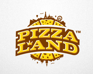
Description:
...a small company with big ambitions
Great service, fresh pizza, and fast delivery!
Status:
Client work
Viewed:
15656
Share:

Lets Discuss
The smaller elements around the rim may get lost when scaled...but, this a really great piece.
ReplyThanks a lot!*yep) I know, but still trend 2011
Replyappetitoso .... yes ... I like this one ... float and fave
ReplyThank you very much TaS!
ReplyGreat work! I would consider filling in the counter of the D.
ReplyThanks Lumavine, maybe you're right...!
ReplyLooks fully loaded! Brilliant logo Nagual. Really does it.
ReplyThank you Steven!*Thanks guys for all your kind comments!!!*
ReplyNice details good job!
Replywoow, great!! nice concept..
ReplyLovely work. But I wish the pizza is a bit more connected with the type.
ReplyGood job I like
ReplyTasty, good job!
ReplyYou can add some red details.
ReplyWow, Gallerized - thanks! *Thanks all guys for the floats and comments.
Replyred details ...?*what do you mean?
ReplyI mean some highlights or shadows could be in red color.
Replylooking very 'franchise' friendly, great work ... I also agree with pjmaster, adding red would make it more tasty
Replyjust GREAT :)*
Replyso tasty %26 nice
ReplyThanks a lot!*@oski*@killanov*@Rokac*@nandy*@Artgeko*@pjmaster*@raja*@hanuman*@LadyGrey *I am very pleased %3D)**
Replyto Pjmaster:*interesting I'll try to do this, thanks!*
Replyvery good job!!!
Replyvery good work, nice
ReplyPlease login/signup to make a comment, registration is easy