Description:
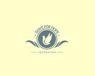
Logo representing a dove, flying for hope. Classic style for a foundation. Feedback is welcome. thx.
As seen on:
-
Status:
Work in progress
Viewed:
5553
Share:



Lets Discuss
It's nice. My only comment would be to flip the direction of the dove. We usually read things from left to right and flipping the dove would give this a more comfortable overall feel.
Reply@sdijock: i hear you. but i tried to reach the perspective of flying against all odds and sadness and problems. against everything that is evil and bad - i wanted to have the wings at the right to suggest that. *thanks for the comment, friend.
ReplyLooks nice but there are too many elements: can you reduce it to just text and dove? I suppose the white dove needs a dark background, but if you want everything %22evil and bad%22 try to find something nastier than a circle. Finally, this dove doesn't appear to be %22flying against all odds%22, but rather floating effortlessly, so perhaps you can redraw it to look like it's really struggling against a gale.
ReplyPlease login/signup to make a comment, registration is easy