Float
(Floaters:
11 )
Description:
Still searching for a name/logo; just a concept.
Status:
Just for fun
Viewed:
2352
Share:

Lets Discuss
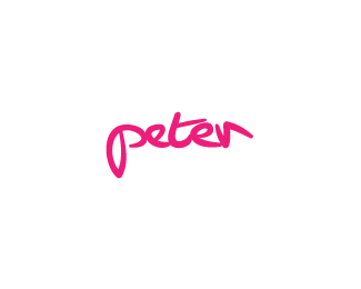
I think I'd like this more if it had a.....flow of some kind to it. Otherwise, I like the more personal, hand-written style.
ReplyAppreciate your comment JF. I get your point with the flow, but not sure about the other part of your comment - it is handwritten, could you explain?
ReplyAnother way for me to say it is I like that the type looks like it was written by your hand. That is a style that conveys a personal touch and I like that.
ReplyAh, now it became clear. Why thank you once more JF. And thanks for the floats to those anonymous people who cannot be identified because they left no other traces of themselves :). By the way, if anyone knows, how come my avatar tries to appear here if I no longer have it uploaded on that gravatar site? Not to mention those weird measurements - I'm lost, could use a helping hand.
ReplyThanks for your comments Peter. No worries, I can handle some critique, if it's constructive :)) ** *Anyway, I think you got yourself a sweet candidate for a personal little mark here. I guess you don't consider this as finished yet, do you? **On the other hand, my little advise would be this: I guess Peter is a common name, and therefore I think you need to make a logo as uncommon as possible for people to remember it... Does this make sense?
ReplySure it does make sense :) As written, it's just a concept - yes, I would not possibly go with it as it is now.%0D*%0D*I am still at the stage of looking for/coming up with a name, not really deciding which one to go for yet. It is a tough decision - not to make, but to create something great to support it.%0D*%0D*Thanks for the advice!%0D*%0D*Oh and as I see it seems that the 'enter' key is finally functioning in the comment section%3B hopefully finally some legibility will make itself at home here, on LogoPond.
Reply%5E Seems it did not work for me. How did you jump to the desired verse, cresk?
ReplyNot sure I follow your last question Peter...**Yeah finally we can make empty lines in the comments section :)**Anyway, why not trying to skip the both e's in ptr :)
ReplySpoczko!
ReplyDzieki Milou!
ReplyPlease login/signup to make a comment, registration is easy