Float
(Floaters:
3 )
Description:
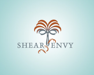
Logo for a hair salon, scissors morph into a palm tree
Status:
Nothing set
Viewed:
2733
Share:



Lets Discuss
Love it! nice work.
ReplyThanks rudy. I appreciate the feedback. I had fun creating this one.
ReplyLooks nice. A few thoughts:*- kerning around the %22A%22 and %22V%22 needs tightened (squint at it or look at it upside down so all you see is the negative space around the letters and you'll see it)*- The warm brown to the cool gray gradient is going kinda muddy at the transition point. The colors are so different that one has to drop out completely as the other ramps up. If you use colors with a bit more in common it's a smoother transition. Green might sell the tree better but green hair? :)*- The upcurved leaves/hair forming the scissor handles read as closed eyes. I can't not see them that way. That could be good or bad. *- The clipped leaves/hairs may not be needed. I dunno.*Lookin' good!
ReplyPlease login/signup to make a comment, registration is easy