Muku
by muku • Uploaded: Jun. 21 '07 - Gallerized: Jun. '07

Float
(Floaters:
79 )
Description:
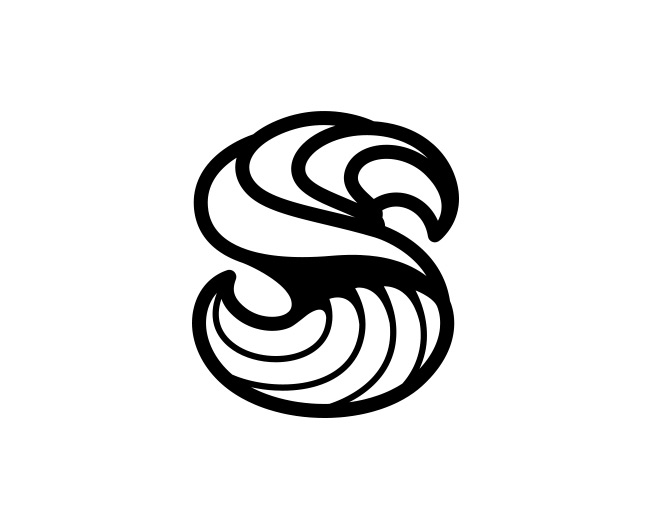
So this is the final version I arrived at. Colors are subject to change depending on the format, and there are actually 2 versions. One version being simply the text making it easier for some formats. This is the color combination used on our new business cards.
As seen on:
www.mukustudios.com
Status:
Client work
Viewed:
20289
Share:


Lets Discuss
This logo gets better every time I see it. Great color choices, I wouldn't change them. Kudos muku!
ReplyThis looks stunning, nice JOB. I really like it.
ReplyGreat job, Muku. I really like how this one came together. You should be very proud!
ReplyVery cool decorative detail.
ReplyThe Mark fits the Name flawlessly.**Well done!
ReplyThanks for all the feedback guys! I'm really happy with the way it turned out :)
ReplyBeautiful image muku!
ReplyVery cool, but too much details...
ReplyVery nice, how long did all the intricate designs around the outside take? You definitely had your work cut out for you :)
ReplyI wish I had the patience and imagination do do this.
Replyhmm.. i think u must be done half of it and then mirror the logo.. rite? :D so, not that much work..
ReplyStill have to come up with the half matrix! Fantastic work muku. Everything is so delicately intricate but still has a strong presence. Love the tentacled friend. Cheers.
ReplyThanks again guys! Yeah, I did half the intricate designs and then mirrored it. I couldn't really say how long it all took. I did the whole logo over about a month or so, on and off, refining the shapes and design. I had other failed concepts too, but this design just ended up feeling the most %22me%22.
ReplyThis is interesting. I'm not keen on the font, but the swirls around the outside are very nice! I'd love to see how this would be used on the website.
Replywow..thats amazing...i have no other comments here...jus hope i learn to do dat decorative detail someday...
ReplyCool!
Replythis is simply great.
ReplyYou do some awesome stuff Muku!
ReplyWhat app did u do this in?
ReplyReally like this logo. Looks good on the eye and the colours are great!
Replyseu design %E9 demais!!! bela personalidade my brother!*abs
ReplyThat must mean I LOVE IT!, how could it be anything else? Wildly good.*
Replybeautiful, colours are perfect
Replyperfect man! animal!!!
Replyrealy interesting, very unusual, yet elegant
ReplyThis amazin!! :)
Replyrealy realy like this one.
ReplyThanks again everyone! I finally updated the type with a style I felt was more appropriate to the rest of the design.
ReplyWhat a cool logo - it would make a great tattoo as well!*Nice website too btw, I've been thinking of switching my own site over to WordPress and your comments on the blog have strengthened my resolve...
Reply10,000 views! I've always loved this one
ReplyThis is awesome, great one.
ReplyHi,I'm Wendy. Your logos delight me.And I make bold to ask you whether you are willing to contribute your logos to our International Top Design Collection?%0D*If yes, please contact me via hightonebooks@126.com.%0D*
ReplyOh wow! So beautiful!
ReplyWow, amazing! great work
ReplyPlease login/signup to make a comment, registration is easy