Float
(Floaters:
9 )
Description:
Another imaginary company.
Status:
Nothing set
Viewed:
4607
Share:
Lets Discuss
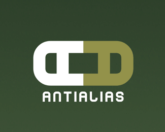
The logotype is interesting, and the logomark is heading in that direction, but I don't see what the point is in the sideways A's. Could you explain?
ReplyI think he was just going for a unique mark with the A letter form.%0D*%0D*If it's a imaginary company - imagine it's for a tyopgraphy house.
ReplyI think the logo mark is a tad bit too big right now. What if it aligns with the wordmark? Also, the kerning (spacing between the letters) seems off...mainly the spacing between the 'n', 't', and first 'i'. The 'L' isn't working for me either. My eye keeps getting stuck there. Just a couple of minor tweaks and this will be solid. Nice job even so.
ReplyI would play on the meaning of the word %22anti-alias%22, especially with the two A's - they could be contrasted with one being clean/vector and one showing anti-aliasing. Maybe stacked and offset with the clean one on top (with the A's being upright %26 normal).**Also, in the existing logo, emphasize the two words by coloring the half opposite with the opposite color. In other words, make the %22anti%22 the lighter green used in the right-hand A, and leave the left-hand A white and the word %22alias%22 white.
ReplyYour suggestions are highly appreciated, folks :)*Thanks for the ideas, I will get to fixing this logo soon %3B)
ReplyPlease login/signup to make a comment, registration is easy