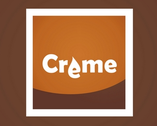
Creme
by mrmotinjo • Uploaded: May. 05 '07

Float
(Floaters:
0 )
Description:
Logo for a fictional chocolate-making company :)
Status:
Nothing set
Viewed:
1787
Share:


Lets Discuss
I like the mark and the colors. Not so sure about all the stylization with the font though. Keep it simple, or maybe try a unique script font. Just some quick thoughts. All in all, not bad.
ReplyI agree, or arrange each of the letters erratically. I like the bite on the mark. Cheers.
ReplyPlease login/signup to make a comment, registration is easy