Architectural Furniture
by mistershot • Uploaded: Jan. 13 '17 - Gallerized: Jan. '17

Float
(Floaters:
28 )
Description:
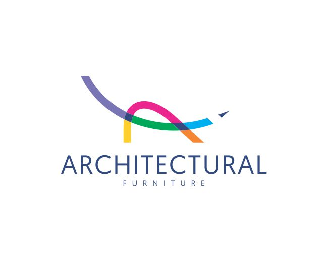
Letter A monogram pencil- chair logo design.
Still working on this one.
filippospente@gmail.com
Status:
Work in progress
Viewed:
7,889
Share:


Lets Discuss
Nice! I would consider using black or dark gray or at least to color the subline same dark blue for logotype for better balance and overall harmony with that interesting colorful mark...
Reply@logoholik @ClimaxDesigns Thank you for your comments and for gallery spot! Updated.
ReplyPlease login/signup to make a comment, registration is easy