Float
(Floaters:
17 )
Description:
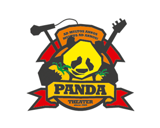
Logo of Panda Theatre (extended).
Status:
Work in progress
Viewed:
5381
Share:


Lets Discuss
Interesting....
ReplyThis is sick.
Replymaybe you can use some dead bodies?
Replyhahaha! :))) GREAT!!! what kind of drugs you have used doing this? I definetely need them too! :)
ReplyThis is awful.
ReplyClimaxDesigns, can I hear your opinion why you have chosen this logo? Just curious :-)
ReplyI disagree. I think the illustration style is kind of cool%3B a little rough, needs some work but still kind of cool. The type on the other hand needs quite a bit more work. Overall though, this has potential.
Replysorry but hope there is some misunderstanding here.
ReplyHm
ReplyHi, thanks for the comments.**the theater is something between comedy and trash art. The logo should look somehow rough and awful. Russians make the theater, so they have wanted a bear, but in a funny style, as if he had taken drugs. Later i completed with two other pets. In this form the logo is used rarely, in the advertisement i used the animals free. Here you could see some examples: http://www.portfoliopool.com/Maxim_Neroda/gallery/1/
Reply%5E I figured as much. I think the illustration says a lot about the style of the theater. This is one of those pieces where a little more context may have helped. I also think a rough, artsy type would have really driven the point home, but I like it just the same.
ReplyI'm usually impressed by the featured logos, but this one does not pass the test in my opinion. **Mistermax, I understand your thoughts on mixing comedy and trash art, but I don't think that message comes across in the final piece. Making a logo look trashy on purpose is one of the more difficult tasks to accomplish. At the moment, the logo looks as if someone wasn't too familiar with the pen tool. Also, the choice of font for the word %22Panda%22 does not fit with the style you're trying to get across (another reason the trash look doesn't work as well). If it were to somehow be tied in either theme or look, it might help convey the look you want.**As it stands now, I feel it needs some work, but I wish you the best of luck in your future design endeavors.
ReplyI like the posters. If the theatre is pretentious and amateurish, then the logo accurately conveys the message. This kind is the mainstream art of nowadays :)
ReplyIf the logo conveys what the company/business represents, then it is effective. Whether or not it is %22tasteful%22 on one's own standards is a whole different idea. Nice job on this.
ReplyThanks guys! Jedah Doma, I am by and large agree. But the project has a lot experimetelles itself. I should mark the logo as %22work in progress%22. I watch how the theater is developing and working on the logo.
Reply:D
Replythe illustration style is very cool. not loving the type choice and the tag line. nice work, mistermax.
Reply@Mistermax - I completely understand where you are coming from. Please don't take my comments as anything more than my musings on the logo. I'm just a simple man throwing my ideas onto the table.**Also, since you are doing this for a client, in the end they have the final say. I applaud what you are trying to accomplish as it is in stark contrast to most of the clean and flowy logos of today. I look forward to seeing more of your work.
Replydunno why.. reminds me of south park morbidity.
ReplyAt the beginning I was like %22what the f*ck%22, but then I saw the posters and I have to say is quite good. Is a little bit like the Novabase logo http://www.underconsideration.com/brandnew/archives/novabase_to_expand_grow_appendage.php**Anyway, I think the typo can upgrade, right now is like they are not finnish. With this illustrations, and a worked typography, this logo can be unique.
Replyas I stated before... this is very interesting and now even more so with the description... I think too many times we (here on the pond) sell ourselves short on what is %22good%22 design by being fed what's on the front page (I know this is now too but...) when really we should be looking beyond that and for things that are %22new%22 and really leading the way... not that there is anything wrong with the old stuff... just let's not judge too quickly.**@mistermax... really well done... nice style.
Reply@nido - Though we shouldn't automatically associate %22new%22 or %22different%22 with %22good%22. They are certainly not one in the same. I do agree logo design has stagnated into a lot of the same tried and true clean and simple designs, but I do not feel this kind of design is leading the way in my opinion.
Reply%5EI meant people would sooner take the safer option than try something %22new%22 designers and clients alike... this may not be leading the way, but it does suggest another way. That is what I meant... %26 I am very much interested by that... just need clients who are too :)
ReplyOh, God.
ReplyHm... very special and dificult to classify. To me it doesn't look really professional, even certainly done by one! ...A painting done by a elephant signed by picasso looks still painted by a elephant - even painted by picasso in a way an elephant would do it %3BD (I hope you know how I mean - without wanting to offend you!!!) . I'm agree with Jedah and also look foreward how this work develops!
ReplyLetters - very well)
ReplyPlease login/signup to make a comment, registration is easy