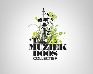
Description:
A collective of artists to keep the spirit of the legendary free podium bar "de muziekdoos" alive.
Status:
Client work
Viewed:
3978
Share:

Lets Discuss
I like that the organic nature of this feels like it's growing and starting to consume the logo. It has an odd conflict and busy feel to it that works for some reason.
Replythanks for the comment. the slogan that the collective uses is %22wild flowers don't care where they grow%22 - the free podium bar had to close down and quite a few musicians and artists had to go out and look for other spaces. I tried to translate this in the design.
ReplySpot on then.
Replystrong contrast between the bold and roman capitals. I also like this way of putting a story in a 'logo' identity. I was wondering. Maybe this is an interesting way of illustrating to overlay the 2 colours and create 1 or more colours. This way the meaning of the concept would also be supported by the colour topic. Anyway: nice illustrative concept!!
ReplyThis is brilliantly executed, satisfying design. Just beautiful.
ReplyPlease login/signup to make a comment, registration is easy