Float
(Floaters:
30 )
Description:
Store with healthy food n stuff.
Status:
Nothing set
Viewed:
5170
Share:
Lets Discuss
love this, milou:)
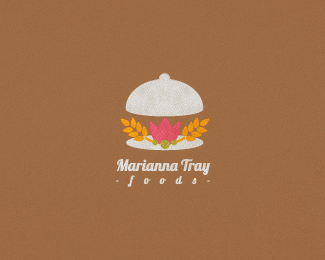
ReplyNow you made me hungry:)*Nice logo buddy! Love the color palette and the style goes very well with the name %22Marianna%22:)
Replyyep, this is very sweet, though' the contrast on pink kinda bothers the eye.
ReplyCheers masters! *I've fixed that contrast issue.
ReplyLove it. I really like the way you add those textures in your designs %3B).
Replyunusual colors for a food industry - but works well!
ReplyThank you fine folks, glad that you liked it!
ReplyUpdated: No hand. I though it was kinda unnecessary.
Replydude, I was confused by three brown rounds in the center of the mark, may be you make them green (peas, for example)
ReplyDude, you are so right. Updated color. Thank you very much.
Replyi would tighten up %22foods%22 a bit..
ReplyLovely! I don't like how %22foods%22 is tracked way out, especially in that script font.
ReplyHey, thanks fellas for the comments, will see what I can do about it later today (%3B
ReplyYay, lumavine ist right, you can%B4t reed properly food why have too much tracking
ReplyIs this really that hard to read f o o d s there? (%3B
ReplyI don't know if it is the readability as much as the way my eye expects a script font with tails to be connected like cursive writing. Tracked out feels like a strange choice with that font, especially with how it contrasts with the text above it. You might be able to get away with it in a neutral sans italic.
ReplyUmm, after time I don't thing it stands out so much, I will left it that way I guess, but thanks for yr point of view, I really appreciate that.
ReplyPlease login/signup to make a comment, registration is easy