Description:
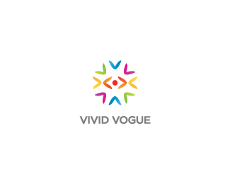
Client wanted bright & colorful mark. They're dealing with garments export. Mark is created with V's, and creates an eye in the middle. Eye for vogue.
As seen on:
milou
Status:
Client work
Viewed:
21378
Share:

Lets Discuss
Type is wonderfull! I would love too see this logo in a white or gray background. The purple in the bg is fighting a little bit with the one in the mark. Great logo %3D)
ReplyHey, looks like no problem - just updated the colors! Thanks for the feedback (:
ReplyEven better :) I like it!
ReplyCheers!
ReplyHey Alen, I've listen to yr thought, and tried to do it uppercase, thinks it really looks better now, what do you think? Thanks for comment.
ReplyNice man! but why there is an eye?
ReplyEye for Vogue (%3B
ReplyClient wanted bright %26 colorful mark %3D Job done!
ReplyI don't think the type is a match Milosz, but the mark is very appealing.
ReplyHey Niall, hope so, I'm still working on the other concepts! %0D*%0D*Hey Joe, I'm not sure about it either, surely it looks better with caps on. Will try to do something else about it! Thanks bro.
Replyur now at best for ur circular formation logos.. cool
ReplyAlen, I'm trying to find the right one, will be updated soon!%0D*%0D*SBJ, haha! (: cheers mate!
Replyhumm! Lowercase is definitely bettter :)
ReplyI've just changed the type, I think it works better now. Seeking for some feedback about it mates. Cheers!
Replythis type defo works for me..congrats on the gallery spot!
ReplyJustin %26 Niall - Cheers bros! I'm glad that you both think so! (: Always an honor to see your work there (:
ReplyNice concept my man! :)
ReplyGITARA!
ReplyGood Luck Milou,.. looks good and has strong meaning.
ReplyMichael - Cheers my man!%0D*%0D*Lukasz - Dzieki wielkie! (:%0D*%0D*Mike - Thanks, still working on the other concepts, we will see how it will turn... %0D*%0D*Andrei - Cheers!%0D*%0D*
ReplyEye for Vogue, great!*
ReplyCheers Jayden!
ReplyGradient looks nice!
ReplyThanks, I've added subtle gradients, also changed the mark shapes to some better curves (%3B
Replyreally love it! what font did you use on the VIVID VOGUE Typo?
ReplyCheers! It was Gotham book.
ReplyBy the way it was accepted by the client.
Replycongrats milou!
ReplyCheers bro!
ReplyYo!
ReplyYo!
ReplyPlease login/signup to make a comment, registration is easy