Float
(Floaters:
108 )
Description:
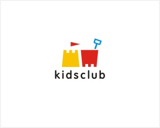
logo for seaside hotel kids club
Status:
Client work
Viewed:
31844
Share:


Lets Discuss
I'm diggin' this one. Pun intended.
Replyvery very nice work!
Replyvery cute, I like this a lot.
Replylooks appropriate!
Replybrilliantly simple... %26 simply clever too...
Replyvery nice.
Replyvery playful!
Replylovely.
ReplyThanks everyone! I really appreciate you're feedback
ReplyYeah, playful it is, nice job!*8/10
ReplyVery good!
ReplyFun shapes and colours, mikeyn.
ReplySimple sweet n strikin
Replygreat.
ReplyThanks a lot, guys!
ReplyI love this!
Replyabsolutely cute and fun.
ReplyReally clever! I love it!
Replynice one...
ReplyYup, this is workin well. It's cool how you flipped the two shapes to create two different objects.
Replyliked this
ReplyThis one all the way. Sands down.
ReplyAwesome!
ReplyThis is sweet work mikeyn!
ReplyHeck of a lot of fun!
ReplyGreat one, simple and yet so effective.
ReplyGreat! So simple and understandable.
ReplyWOW thanks guys, I appreciate the comments and floats !
Replyquite appropriate for a kids club by the seaside.
ReplyThanks Mike !
ReplyVery nice, great use of shapes.
Replythanks brandsimplicity
Replydefinitely brings back some awesome sand castle building memories...good work!
ReplyThanks Matt, nice to hear that !
ReplyClever! Great work!
ReplyVery playfull and fun :)
Replysaawan and Nancy thanks guys!
ReplySimple... congrats..!
ReplyAwesome!
Replysimple simple simple %3D awsome!
ReplyThanks Adrian, Tomas, Jonny !
Replycute and simple!
Replylovely
ReplySuper!
ReplyPlease login/signup to make a comment, registration is easy