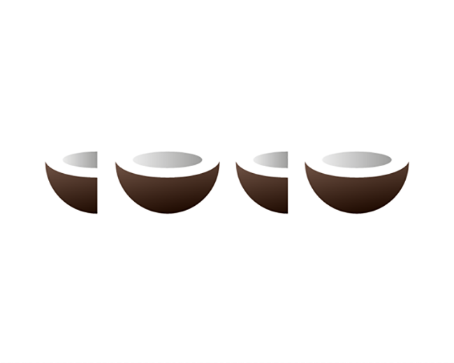
COCO
by michaelspitz • Uploaded: Oct. 25 '17 - Gallerized: Nov. '17

Float
(Floaters:
53 )
Description:
Unused logotype exploration.
Status:
Unused proposal
Viewed:
4,166
Tags:
•
food
•
lettering
•
typography
Share:


Lets Discuss
Really really nice concept. Would love to see it in black or brown. I didn't read COCO at first sight because of the gray part of the coconuts. But maybe it's just me. :)
ReplyCleaver!!
ReplyPlease login/signup to make a comment, registration is easy